Curve fitting
Enter at least two columns of data and then use the "Charts/Interpolation" tool. This tool offers several types of interpolation, including polynomials, splines and Kohonen neural networks. For more than two variables, use the "Charts/Regression analysis" tool, that can produce regression polynomials up to 4th order or the "Charts/Kriging" tool that is suitable for modelling complex, high-order relationships.
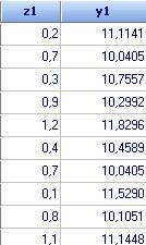
Let us try and find formula that describes the variable y1 as function of z for the following data (examples\13-Other data.qsl)
Click icon ![]() . To
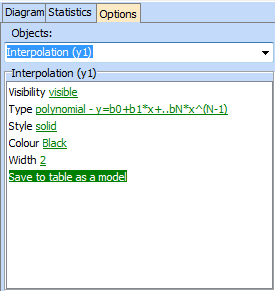
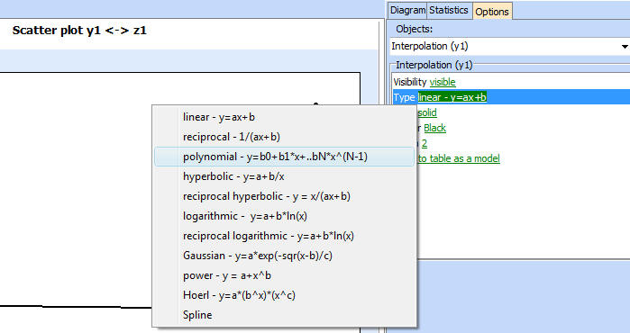
choose an interpolation formula we click “Options” and then “Interpolation (y1)”
from the menu shown below.
. To
choose an interpolation formula we click “Options” and then “Interpolation (y1)”
from the menu shown below.
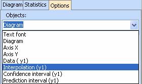
Simple linear regression is chosen by default, but we can choose another interpolation formula from the Interpolation menu. Don't forget to change Visibility to visible in order to display the interpolation curve
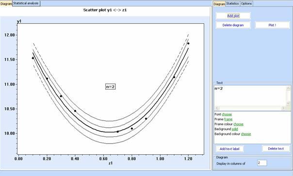
Different options can be chosen and compared by graphical and statistical analysis. Diagrams showing the interpolation with different formulae can be put on one and the same panel. This makes possible to compare visually the quality of interpolation. Click “Add plot” on the Diagram tab, to add a new diagram. Diagrams can be deleted or text can be added on them.
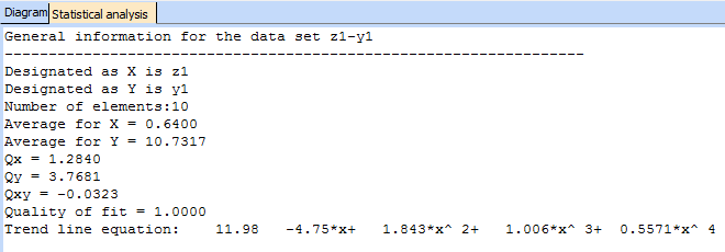
Interpolation formulae and further details are shown in the statistics tab
Prediction and confidence intervals can be added for the linear and the polynomial models.
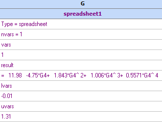
Once we are happy with the interpolation, it is possible to transfer the obtained equation to the spreadsheet and be used further as a model. To see the actual formula in the spreadsheet, click the 'Show formulae' button. Further information on the spreadsheet models can be found here.