
Control charts - variables
Included control charts:
Sample size for calculation of the statistics can be varied or specified as subgroups. Tolerance limits are available only for Tolerance charts and Individual values charts, because due to risk of false "violated limit" interpretation with charts that plot grouped data. To compute capability indices, the user should provide tolerance limits (See Histograms for further details on statistical indices).
The data for the following plots is in 5-Control charts-variables.qsl, which is supplied in the examples directory. A chart can be constructed by using a single column of data and nothing else, for example the column "resistance". Use the Charts/Control charts-variables to construct the plots. Then apply the following settings:
Change the type to Xi-MR and click the Zones check box.

The zones shown on the Xi chart are spaced in 1 standard deviation intervals. Therefore the width of the most outer zone is 6sigma. The red lines represent the control limits (LCL and UCL). One can specify tolerance limits in the Options section:

which results in this Xi-MR chart:

It is also possible to change the appearance of various elements of these charts, by using the right mouse button anywhere on the chart.

It is also possible to use data that has been grouped. In this case a pair of columns is required - one containing the data itself, and the other specifying the number of the group that data belongs to. Example of such pair are "strength" and "number". "Strength" should be used as data column, and "number" as subgroup column. Due to the variable size of the groups, control limits and centre lines of the control charts are also varying.


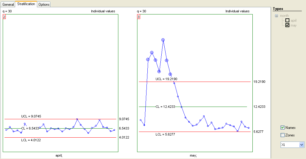
Stratification is also possible, if 'type' columns are added - for example ("worker" and "machine"). The following example shows stratified charts for the biological oxygen demand (BOD) of a river over two months. The data are in columns "month" (type) and "BOD" (data), and we have used the following settings:

The stratified control chart shows that in May the river was significantly polluted.
To observe the trends of a process with grouped data, it is possible to plot both control chart and a tolerance chart. The following example shows a Xbar-R chart and a Tolerance chart for "resistance-1" in file 5-Control charts-variables.qsl. The data are grouped in 2. These are the corresponding settings and results:


One can see that although the process seems to be under 'statistical' control, it produces high number of defects.
See 'Histograms' for details on capability indices.